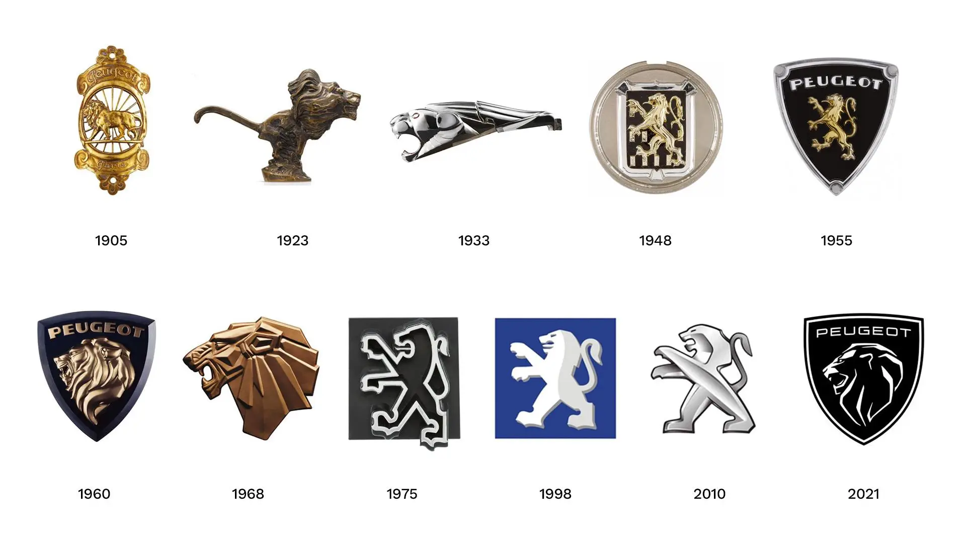
Peugeot Logos: History, Meaning and Evolution of the Lion
Peugeot logos have changed many times over the years, but one thing has stayed the same: the famous lion. From the early emblem used on steel products to the modern shield badge on today’s cars, the Peugeot logo tells the story of a brand with a long history.
If you own a Peugeot or are interested in the brand, you may have noticed that older cars have different badges from newer models. So, why did Peugeot change its logo? What does the lion mean? And which design is used today?
In this guide, we look at Peugeot logos through the years, explain the meaning behind the lion and explore the changes that led to the latest design.
What Does the Peugeot Logo Mean?
The Peugeot logo represents strength, speed, quality and the history of the company. Its famous lion was first chosen to represent the qualities of Peugeot’s steel saw blades.
When Peugeot started making steel products, the company wanted a symbol that customers could recognise easily. The lion was a natural choice because it represented three important qualities:
- Strength: The lion’s strong teeth represented the strength of the saw blades.
- Flexibility: Its flexible spine represented the flexibility of the steel.
- Speed: The lion’s quick movement represented the cutting speed of the blades.
These ideas became part of Peugeot’s identity. Later, when the company started producing cars, the lion became its main symbol in the automotive world.
You can read more about the story in Peugeot’s official article about the history of the Peugeot Lion.
Peugeot Logos Through History: A Complete Timeline
The history of Peugeot logos goes back more than 170 years. During this time, the company has introduced several designs, but the lion has remained at the centre of its identity.
Here are the main stages in the logo’s development.
1. The Original Peugeot Logo (1850–1889)
The original Peugeot lion design dates back to 1850. It showed a lion walking along an arrow.
At that time, Peugeot was known for producing steel products, tools and saw blades rather than cars. The lion was used to show the quality and strength of these products.
An important date came on 20 November 1858, when Émile Peugeot registered the lion as the company’s emblem.
This was the beginning of a symbol that would become famous around the world. Although the design looked very different from today’s badge, its main idea was already clear: strength and quality.
2. Early Peugeot Lion Logos (1889–1920)
As Peugeot grew, the lion design started to change.
The company used different versions of the emblem on its products. Some designs showed a detailed lion, while others used simpler outlines.
During this period, Peugeot was also moving further into the automotive industry. The lion gradually became more closely linked with its vehicles.
By around 1907, the emblem was appearing on cars produced by the Lion Peugeot branch of the family business.
3. Peugeot Car Logos in the 1920s and 1930s
During the 1920s, Peugeot began using lion figures on vehicle radiator caps.
These designs gave cars a more distinctive appearance. Some showed the lion standing proudly, while others showed it in motion.
Later, Peugeot began placing the lion directly into the front grille of its vehicles.
This was an important change because the badge became easier to recognise when looking at the front of a car.
4. The Peugeot Shield Logo (1948–1960)
After the Second World War, Peugeot introduced new designs for its vehicles.
The Peugeot 203, launched in 1948, helped bring a new look to the company’s identity. The lion appeared in different positions and eventually became part of a shield-shaped emblem.
This shield was inspired by traditional heraldic designs and reflected the company’s French roots.
However, Peugeot continued to make changes to the shape and style of the badge over the following years.
5. Peugeot Lion Logos in the 1960s
The 1960s brought another important period in the development of Peugeot logos.
The company used a more modern lion design on its vehicles. For example, the Peugeot 404, launched in 1960, featured a distinctive lion emblem.
In 1968, Peugeot introduced further changes to its branding. The lion became simpler and more suitable for modern vehicle styling.
As a result, the badge started moving away from older, detailed animal illustrations.
6. The Modern Peugeot Lion Logo (1975–1998)
In 1975, Peugeot introduced a more modern lion design.
The emblem used clear lines and a simpler shape instead of the detailed lion figures seen in earlier versions.
This made the badge easier to use across different vehicles and marketing materials.
The design also suited the styling of Peugeot models during the 1980s and 1990s.
7. Peugeot Logo from 1998 to 2010
In 1998, Peugeot updated its lion emblem again.
The new version used a more solid appearance, with a metallic finish that gave the badge a modern look.
It was designed to fit the appearance of the company’s newer vehicles.
During this period, Peugeot continued to build a strong reputation in the European car market. The updated lion helped maintain a clear brand identity.
8. Peugeot Logo from 2010 to 2021
In 2010, Peugeot introduced another major update.
The lion became more detailed, with a shiny three-dimensional appearance. It was designed to look modern and stand out on the front of the car.
This version appeared on many popular models, including the Peugeot 208, 308, 2008, 3008 and 5008.
For many drivers, this is still the most familiar Peugeot badge because it appeared on so many vehicles.
9. The New Peugeot Logo (2021–Present)
On 25 February 2021, Peugeot officially introduced its latest logo.
Instead of showing the full body of a lion, the new design features a lion’s head inside a shield.
The design was created by Peugeot Design Lab and marked an important change in the company’s visual identity.
Its main features include:
- A lion’s head shown in profile.
- A bold shield-shaped badge.
- A strong black and white design.
- A modern appearance for websites and digital platforms.
- A connection with Peugeot’s historic emblems.
The new logo first appeared on the latest generation Peugeot 308.
According to the company’s official announcement, this was the eleventh version of its logo since 1850.
For more details, see the official Peugeot 2021 logo announcement from Stellantis.
Why Did Peugeot Change Its Logo in 2021?
Peugeot changed its logo to give the brand a fresh look and reflect the direction of its newer vehicles.
The previous badge had a three-dimensional lion. Although it was popular, the company wanted something different that could work across cars, websites, advertising and digital services.
The new shield design offered several benefits.
A fresh appearance: The lion’s head gives the badge a different look while keeping the familiar symbol.
A link to the past: The shield connects the new design with earlier Peugeot emblems.
Better digital use: The simpler design works well on websites, mobile screens and social media.
A stronger brand identity: The new badge supports Peugeot’s move towards a more premium image.
Therefore, the change was not just about making a new car badge. It was part of a wider update to the Peugeot brand.
What Is Special About the New Peugeot Lion Logo?
The latest Peugeot logo is different because it focuses on the lion’s head rather than the full animal.
The lion’s face represents confidence, strength and the company’s history. Meanwhile, the shield gives the badge a classic appearance.
The design also uses strong contrast, making it easy to recognise on different backgrounds.
According to Peugeot’s design team, the shield is also a reference to the brand’s heritage. Its modern shape connects the company’s past with its future.
You can learn more about the design process in Stellantis’ explanation of Peugeot’s new brand identity.
Which Peugeot Cars Have the New Logo?
The new Peugeot badge first appeared on the latest generation Peugeot 308 in 2021.
Since then, the company has introduced the design across newer models and updated versions of its vehicle range.
You can find the modern shield badge on newer versions of models such as:
- Peugeot 208
- Peugeot 2008
- Peugeot 308
- Peugeot 408
- Peugeot 3008
- Peugeot 5008
- Peugeot electric models
However, the badge can depend on the model year, generation and market.
For example, an older Peugeot 208 may have the previous three-dimensional lion, while a newer version may feature the shield design.
If you are planning to buy a used Peugeot, check the vehicle’s production year and specification before identifying its badge.
You can also explore our Peugeot 208 price, specifications and features guide to learn more about this popular hatchback.
Old Peugeot Logo vs New Peugeot Logo: Main Differences
The biggest difference between old and new Peugeot logos is the way the lion is displayed.
Older designs often showed a complete lion, either standing or walking. Later versions used a more modern metallic lion.
In comparison, the latest design focuses on the lion’s head inside a shield.
Here is a simple comparison:
| Feature | Old Peugeot Logo | New Peugeot Logo |
|---|---|---|
| Main design | Full lion figure | Lion’s head |
| Shape | Different shapes over time | Shield |
| Appearance | Often metallic and three-dimensional | Bold and modern |
| Style | Traditional automotive badge | Modern brand identity |
| Latest introduction | 2010 version | 2021 version |
Both designs represent the same company. However, the newer badge gives Peugeot a different look while keeping its famous lion.
How Many Peugeot Logos Have There Been?
Peugeot has introduced eleven main logo versions since 1850, according to its official announcement in February 2021.
This means the company has updated its visual identity several times while keeping the lion as its main symbol.
Each version reflects the design trends and direction of the company at that time.
For example, older badges used detailed animal figures, while newer designs focus on simple shapes and clear lines.
The changes show how Peugeot has adapted its image without losing the symbol that customers recognise.
Are Peugeot Logos Different on Older and Newer Cars?
Yes. Peugeot badges can look quite different depending on the age and model of the vehicle.
Older cars may feature a standing lion, a walking lion or a metallic emblem. In contrast, newer vehicles use the shield-shaped lion’s head design.
There can also be differences between brochures, promotional materials and the actual badge fitted to a vehicle.
Therefore, if you are identifying a Peugeot by its logo, it is better to check the model and production year as well.
This is especially useful when buying a second-hand car or looking for replacement badges.
Frequently Asked Questions About Peugeot Logos
1. What does the Peugeot logo mean?
The Peugeot logo represents strength, flexibility, speed and quality. The lion was originally selected to reflect the qualities of the company’s steel saw blades.
2. When was the first Peugeot logo introduced?
The original lion emblem dates back to 1850. However, Peugeot officially registered the symbol on 20 November 1858.
3. When did Peugeot introduce its new logo?
Peugeot officially revealed its latest shield-shaped lion logo on 25 February 2021.
4. Why does Peugeot use a lion in its logo?
Peugeot chose the lion because it represented the strength, flexibility and cutting speed of its early steel products.
5. What is the difference between old and new Peugeot logos?
Older Peugeot logos often showed a complete lion. The latest design uses a lion’s head inside a shield-shaped badge.
6. How many Peugeot logos have been made?
Peugeot announced that its 2021 badge was the eleventh version of its logo since 1850.
7. Which car first received the new Peugeot logo?
The latest shield badge made its vehicle debut on the new generation Peugeot 308 in 2021.
8. Does the Peugeot logo represent strength?
Yes. Strength is one of the main ideas behind the lion symbol. It originally represented the quality and durability of Peugeot’s steel products.
9. Do older Peugeot cars have different badges?
Yes. Older models use earlier versions of the lion emblem. The design depends on the vehicle’s age and generation.
10. Is the 2021 Peugeot logo still the latest design?
The shield-shaped lion introduced in February 2021 remains Peugeot’s latest officially announced main logo design.
Final Thoughts on Peugeot Logos
The history of Peugeot logos shows how a simple symbol can become an important part of a company’s identity.
The lion started as a mark of quality on steel products. Later, it became one of the most recognisable symbols in the automotive industry.
Over the years, Peugeot has changed the shape, colour and style of its badge. However, the lion has remained at the centre of the design.
Today, the modern shield logo connects the company’s long history with its latest vehicles and electric-car plans.
Whether you prefer the older metallic lion or the newer shield badge, both designs represent the same Peugeot heritage.
For more information about Peugeot vehicles, comparisons and ownership advice, explore the latest guides on PeugeotDrive.